What’s the 80/20 newsletter? Created by LOGO.com, each issue breaks down one small but powerful marketing tip that drives big results for businesses. Let’s get into it!
Product Spotlight 📢
Your slogan for {{business_name}} is ready!
Generate a catchy slogan in seconds.
The 80/20 Sticky CTA Rule
Hi {{given_name}},
Ever had to scroll through an entire landing page, then have to scroll back up to find the action button you saw earlier?
This common design can create unnecessary friction in the user experience right when visitors want to take the next step.
💡 This week's 80/20 rule - Make your primary call-to-action button "sticky" so it remains visible at the bottom of the screen as visitors scroll through your page.
Why This Rule Works
🧠 When users navigate lengthy pages, they experience what researchers call cognitive load - the mental effort required to process information and remember where things are located.
A sticky CTA eliminates the additional cognitive burden of remembering button locations or scrolling back to find them. Research shows that sticky CTAs consistently improve user engagement by reducing the friction between intent and action.
It's like keeping important navigation tools always within reach - similar to how your phone's back button is always available no matter what screen you're viewing.

Businesses That Leverage This Rule
☕ Starbucks seamlessly integrates sticky CTAs into their rewards ecosystem. Their mobile app features a persistent "Order" button that remains visible as customers browse menu items and customization options. This design approach demonstrates how maintaining button visibility throughout the browsing experience reduces the mental effort required to complete an action.
💆♀️ Heyday Skincare implements a persistent "Book a Facial" CTA directly into its main navigation header. As a potential client scrolls down the page to read about different facial services, esthetician bios, and locations, the primary conversion-driving button never leaves their sight. This design ensures that the moment a user's interest is high, the path to scheduling an appointment is immediately accessible.
🐶 Crown & Paw turned a simple discount into a powerful, persistent sales driver with a sticky bar. Instead of just showing a coupon code in a pop-up, they used a "coupon code reminder sticky bar" that remained visible as shoppers browsed. This small change, which kept the offer top-of-mind, resulted in a 38% increase in orders by reducing friction and reminding users of the value they were getting.
How to Apply This Rule to Your Business
🤝For Service-Based Businesses
Position Sticky CTAs After Trust-Building Content
Instead of showing your sticky button immediately, let it appear after visitors have scrolled past your credentials or case studies. This timing respects the natural information-gathering process while keeping the next step accessible once they're ready.
Create Sticky Contact Forms with Minimal Fields
Transform your lengthy contact forms into sticky elements that request only essential information. A simpler form reduces the perceived effort required to get in touch, making it easier for visitors to take that first step.
For a web design agency, consider just "Name" and "Tell us about your project (optional)" fields in a sticky footer. For a financial advisor, try "Email" and "What brings you here today?" in your persistent contact bar.
Deploy Time-Specific CTAs That Set Clear Expectations
Replace vague "Contact Us" buttons with sticky CTAs that specify exactly what happens next. When visitors understand the time commitment and next steps, they experience less uncertainty about taking action. For a business coach, consider: "Book a 20-Minute Introduction Call." For an IT consultant, try: "Schedule a 15-Minute Security Review."
🛍️For Ecommerce Stores
Implement Sticky Add-to-Cart Buttons
Your sticky CTA should display the customer's current selections in real-time. When someone selects "Medium, Blue" for a t-shirt, the sticky button should confirm their choice by showing "Add Medium Blue Tee to Cart" rather than generic "Add to Cart" text.
For a supplement store selling protein powder: Display "Add 2lb Vanilla Whey to Cart" once selections are made. Include a small "Change Size" link within the sticky element for easy modifications.
Create Mobile-Optimized Sticky CTAs in the Thumb Zone
Position your sticky buttons in the bottom 20% of mobile screens where thumbs naturally rest. Make buttons at least 48 pixels tall with high-contrast colors that stand out against your site background - this follows basic accessibility guidelines for touch targets.
Use Progressive Sticky CTAs That Appear After Key Information
Don't show sticky CTAs immediately. Let them appear after customers have seen your product images and main benefits - typically after 30-40% scroll depth on mobile.
For example, a furniture store selling sofas: Trigger the sticky "Customize Your Sofa" button after the dimensions and fabric sections. For a skincare brand: Display "Add to Routine" after ingredient lists and usage instructions.
TLDR
1️⃣ The rule change: Make your primary CTA button "sticky" so it stays visible at the bottom of the screen as visitors scroll, ensuring your next-step action is always accessible.
2️⃣ Why it works: Sticky CTAs eliminate the cognitive load of remembering button locations. Research shows this approach reduces friction in the user experience.
3️⃣ The result: Create a more seamless browsing experience by ensuring your CTA is present exactly when visitors want to take the next step, without requiring them to search for it.
Website Review

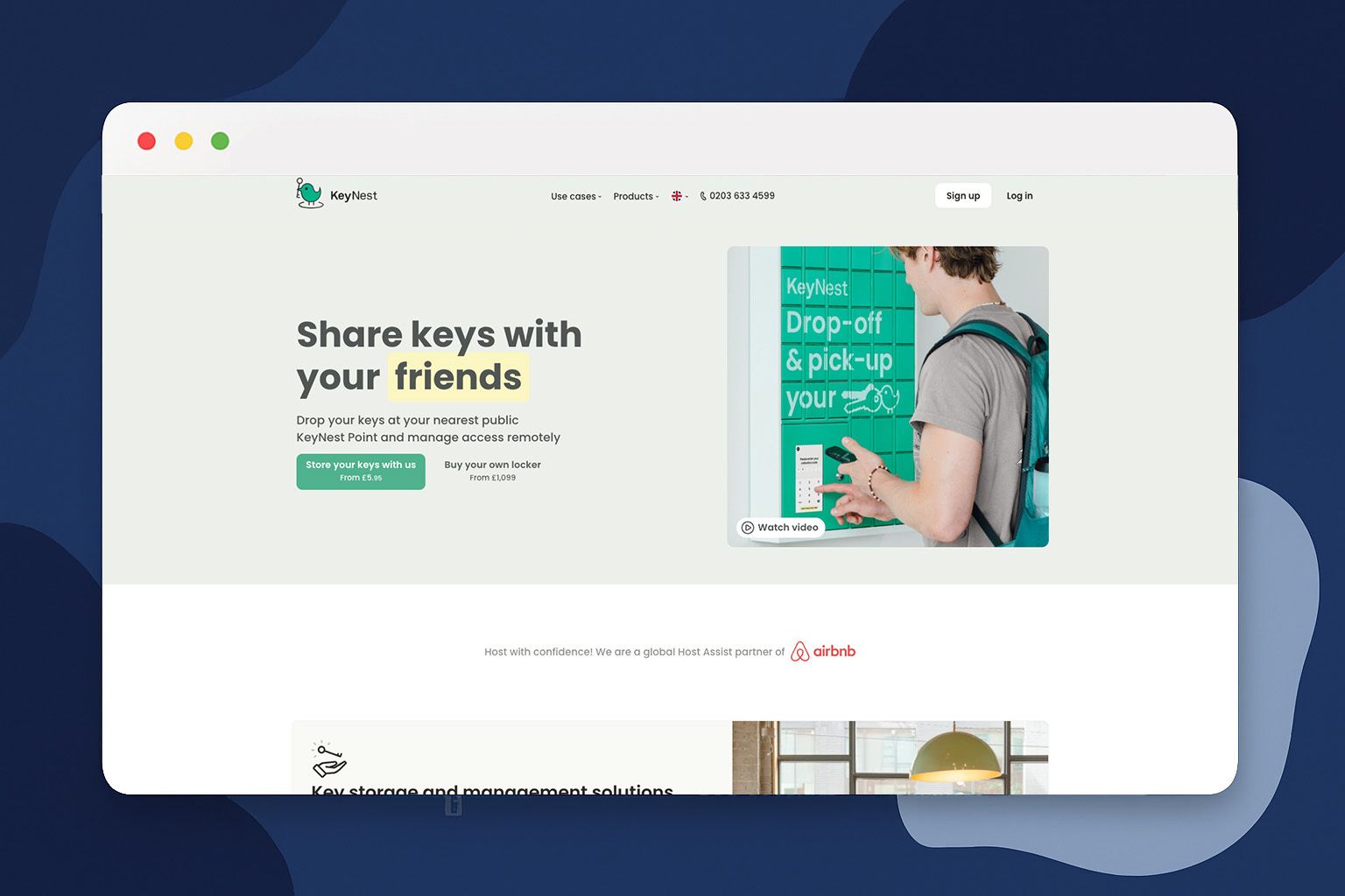
🔎 For this week's website review, let's look at KeyNest. KeyNest is a smart key management service that helps property managers, Airbnb hosts, and estate agents handle secure key exchanges through a network of over 7,000 physical locations.
💡 The Good:
Problem-first messaging: Their strong messaging, "Every property manager's biggest worry is losing track of keys," addresses the specific pain point upfront. By doing this, KeyNest establishes credibility and ensures the right audience stays engaged.
Features translated into tangible benefits: Instead of just saying "real-time dashboard," they explain exactly what users will see: color-coded alerts for late returns, location-based filtering, exportable access logs. This helps property managers visualize exactly how KeyNest would fit into their daily operations.
Immediate trust display: "5m+ guests checked in since 2016" and "Every 30 seconds one of our keys is collected" transforms abstract claims into tangible proof of reliability. These specific numbers reduce the perceived risk of adopting a new service provider by demonstrating established market presence.
🔧 Suggestions:
Add visuals of the physical experience: The site describes the service well but would benefit from photos or videos showing actual KeyNest points, how customers interact with them, or what the physical infrastructure looks like.
Optimize for mobile-first: Given that property managers work on-the-go, the mobile experience could be enhanced. Features like location finders, mobile-optimized content, and clear app download options would better serve this audience.
See you next time for another simple, high-impact strategy!
The LOGO.com Editorial Team
