What’s the 80/20 newsletter? Created by LOGO.com, each issue breaks down one small but powerful marketing tip that drives big results for businesses. Let’s get into it!
The 80/20 Headline Rule
Ever notice how some websites talk about their "advanced analytics dashboard" or "AI-powered features" while you're left wondering, "But what does this actually do for me?"
You're not alone – most businesses focus on what they have rather than what you'll achieve.
💡 This week's 80/20 rule - Focus your headline messaging on customer benefits and outcomes, not product features.
In other words, lead with what customers can accomplish or achieve with your product, not what your product technically does.
This simple shift in focus can dramatically improve your engagement and conversion rates without changing anything else about your business.
Why This Rule Works
🧠 Our brains are wired to make emotional decisions first, then justify them logically afterward.
When you encounter a headline, your brain spends mere seconds deciding whether to engage – and during those precious moments, it's scanning for personal relevance and value, not technical specifications.

Research shows that headlines triggering personal outcomes and benefits receive up to 42% more engagement than feature-focused headlines.
This happens because benefit-focused headlines activate what psychologists call "System 1" thinking – the fast, automatic decision-making system that requires minimal cognitive effort.
Features, on the other hand, require "System 2" thinking – the slower, analytical process that demands significant mental energy.
Think about it this way:
When you're scrolling through your inbox or browsing online, you're not looking for more work. You're looking for solutions to your problems.
A headline that says "Cloud-Based Software Platform" requires you to translate that into what it means for you.
But a headline that says "Cut Your Admin Time in Half" immediately connects with your desire to save time.
The legendary David Ogilvy famously stated that when you've written your headline, you've spent eighty cents out of your dollar.
Why?
Because approximately 80% of people will read your headline, but only 20% will continue reading. If your headline doesn't immediately communicate value, you've lost the vast majority of your audience before they even start.
Businesses That Leverage This Rule
💰 Dollar Shave Club revolutionized the razor industry not by talking about blade technology or precision engineering, but with headlines like "Shave Time. Shave Money."
While Gillette was promoting their latest blade innovations, Dollar Shave Club focused on the outcomes customers actually cared about: convenience, affordability, and simplicity.
This benefit-focused approach helped them build a billion-dollar business that Unilever eventually acquired.
💬 Slack dominates the B2B communication space with headlines like "Where work happens" and "Be more productive at work" rather than diving into technical specifications about messaging protocols or integration capabilities.
They understand that business decision-makers care about team productivity and collaboration outcomes, not the underlying technology.
🏠 Airbnb transformed travel accommodation by focusing on experiences rather than property features.Instead of headlines about square footage or amenities, successful Airbnb listings use headlines like "Victorian Charm in Historic Boston" or "Beachfront Bliss in Malibu".
These experience-focused headlines consistently achieve higher booking rates because travelers are buying memories and experiences, not just a place to sleep.
How to Apply This Rule to Your Business
Ready to give it a try? You can do this for any type of business, whether you sell products or services.
🤝For Service-Based Businesses
Focus on your most important action
Start by identifying the #1 outcome your clients achieve by working with you.
Is it saving time? Reducing stress? Growing revenue? Making better decisions?
Once you've identified this core benefit, make it the star of your homepage headline.
Make your offer clear
Apply the "So What?" test to every headline you write.
Take your current headline and ask "So what does this mean for the customer?" Keep asking until you reach a specific benefit.
For example, if your headline says "Professional Accounting Services," ask "So what?"
The answer might be "Accurate bookkeeping."
Ask again: "So what?"
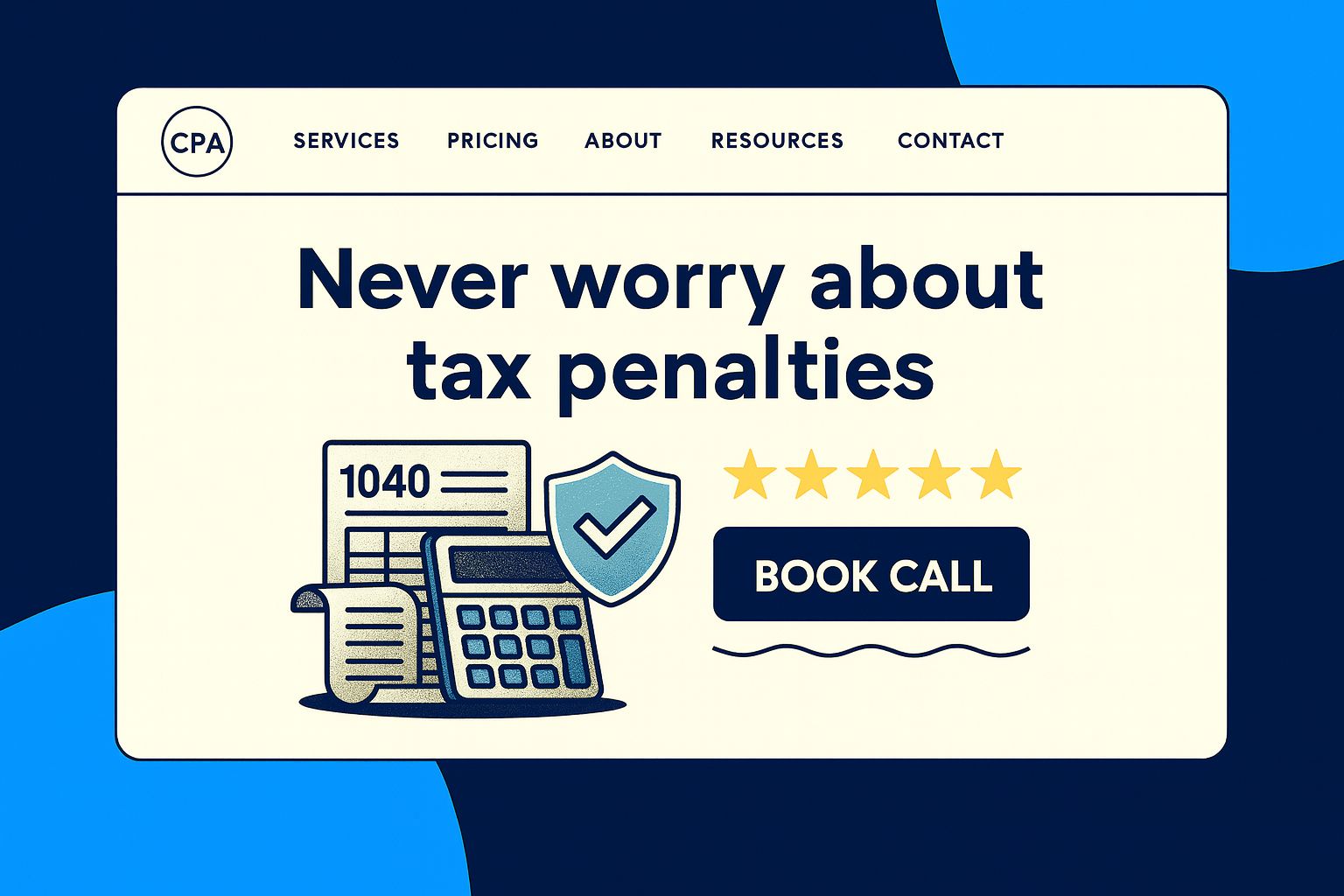
This leads to "Never worry about tax penalties" or "Sleep soundly knowing your finances are handled."

Have a strong supporting call-to-action
Create benefit-focused headlines for each service page.
Instead of "Social Media Management," try "Get 5 Hours Back Every Week."
Instead of "Business Consulting," use "Double Your Profit Margins in 90 Days."
Be specific with numbers and timeframes when possible – headlines containing specific numbers perform 36% better.
🛍️For Ecommerce Stores
Showcase a core benefit, not products
Your homepage should feature one primary benefit-focused message, not a catalog of products.
Instead of "Shop Our Collection," try "Find Your Perfect Style in Minutes" or "Get Restaurant-Quality Meals Delivered Fresh."
This creates an immediate emotional connection before customers even see your products.
Add benefit statements
Transform product page headlines from feature descriptions to benefit statements.
Instead of "Wireless Bluetooth Headphones," use "Enjoy Crystal-Clear Calls Anywhere."
Instead of "Organic Cotton Sheets," try "Wake Up Refreshed Every Morning."
The product features support the benefit, but the benefit leads the conversation.
Audit your category pages
Category pages need benefit-focused headlines too.
Rather than "Women's Running Shoes," consider "Run Faster, Longer, Pain-Free" or "Find Your Perfect Running Companion."
These headlines help customers envision the outcome of their purchase, not just the product category.
Summary of Rule and Actions
1️⃣ Audit your current headlines. Look at your homepage, top landing pages, and highest-traffic content. For each headline, identify whether it's feature-focused or benefit-focused. Prioritize rewriting the ones with the most visibility first.
2️⃣ Apply the "So What?" test ruthlessly. Take every feature-focused headline and ask "So what does this mean for the customer?" repeatedly until you reach a specific, emotional benefit that addresses real customer desires or pain points.
3️⃣ Create 3-5 benefit-focused variations for testing. Don't settle for your first rewrite. Develop multiple benefit angles and test them against each other. What resonates most might surprise you.
4️⃣ Use customer language, not corporate jargon. Analyze support tickets, reviews, and sales conversations to understand how customers describe their problems and desired outcomes. Use their exact words in your headlines when possible.
5️⃣ Track the right metrics for validation. Monitor click-through rates, conversion rates, time on page, and bounce rates. Benefit-focused headlines should improve all of these metrics if they're truly connecting with customer motivations.
Website Review

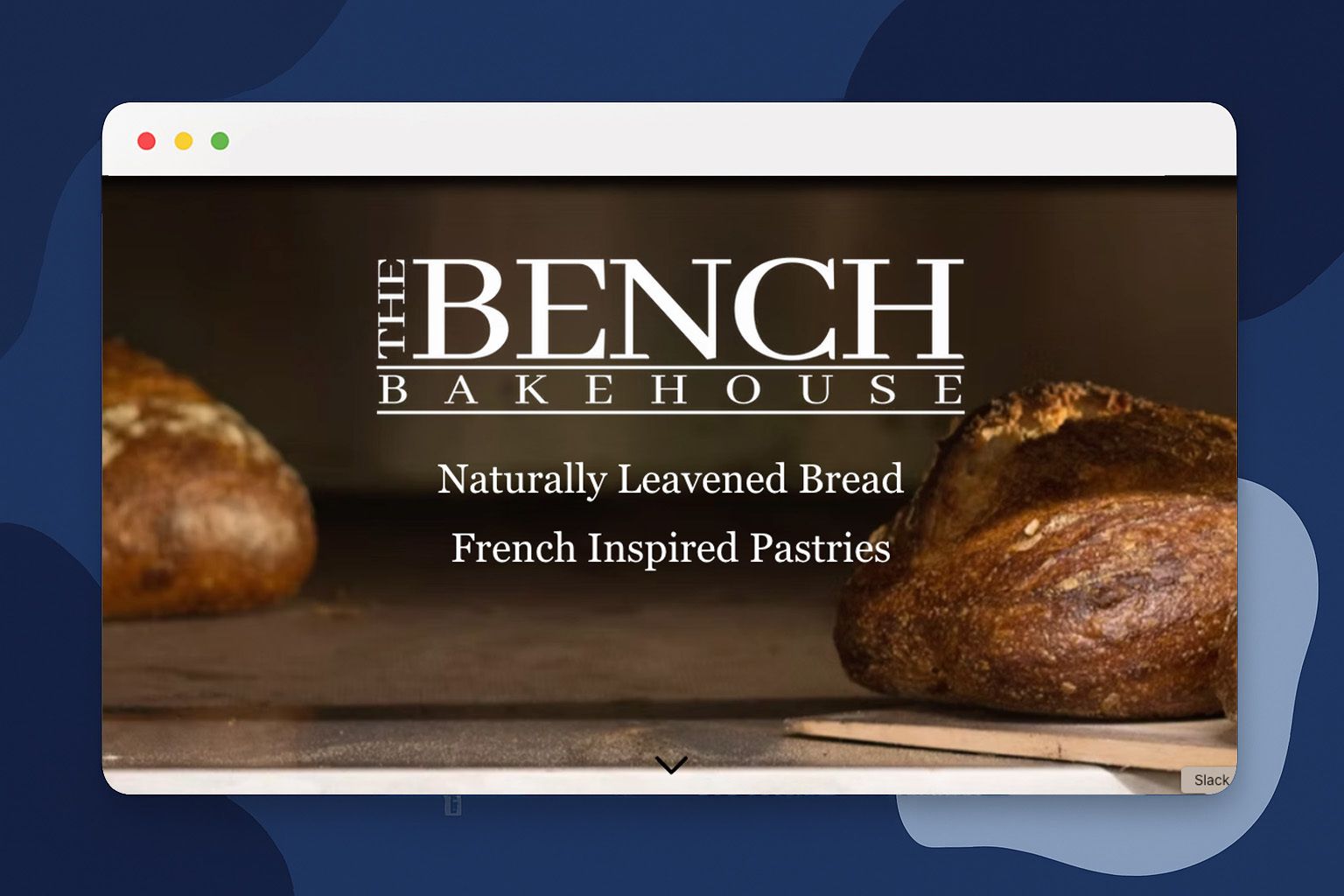
🔎 For this week’s website review, let’s look at The Bench Bakehouse. The Bench Bakehouse is a charming artisan bakery in Vancouver, Canada, that specializes in delicious sourdough bread and French-inspired pastries. Their website is straightforward and effectively communicates their "Simple. Natural. Delicious." brand.
💡 The Good:
Mouth-Watering Photos: They know that people eat with their eyes! The site is full of high-quality, appetizing photos of their baked goods that make you want to place an order immediately.
Simple, Clear Messaging: Their tagline and headings quickly tell you what they're all about: naturally leavened bread and quality pastries. It's easy to understand and sets the right expectations.
Easy Online Ordering: The online order page is a simple, no-frills list. While not fancy, it's easy to navigate and lets customers quickly pick out what they want without any confusion.
Authentic Storytelling: They share details about their slow fermentation process and use of quality Canadian ingredients, which builds a story of craftsmanship and helps them stand out.
Well-Placed "Order Online" Buttons: After reading about how delicious their bread and pastries are, there's a convenient "Order Online" button right there, making it easy to go from craving to purchasing.
🔧 Suggestions:
Upgrade to a Real eCommerce System: The current ordering page feels more like a digital menu than a store. Moving to a more dedicated eCommerce platform could provide a much more professional experience with a proper shopping cart and checkout.
Make Key Info More Prominent: The physical address and hours aren't immediately visible on the homepage. For a local bakery, this critical information should be right at the top.
Focus on a Mobile-First Design: The site isn't fully optimized for mobile. A redesign focused on a clean mobile experience with large, tappable buttons would be a huge improvement for customers on the go.
See you next time for another simple, high-impact strategy!
The LOGO Editorial Team
