What’s the 80/20 newsletter? Created by LOGO.com, each issue breaks down one small but powerful marketing tip that drives big results for businesses. Let’s get into it!
Product Spotlight 📢
Your website for {{business_name | your brand}} is ready!
In partnership with Wix, our AI-powered website builder will add the final touches for you to review.
The 80/20 Favicon Rule
Hi {{given_name}},
Is a generic browser icon sabotaging the professional look of your new site?
That tiny missing detail might be silently whispering "amateur" to every single person who lands on your site. And in a world where 75% of website credibility judgments come from design factors, that whisper can cost you trust before anyone reads a single word.
💡 This week's 80/20 rule: Create a simple favicon using your logo's main element or brand initial, and upload it to your website in the next 10 minutes.
Why This Rule Works
🧠 Think of a favicon like a name tag at a networking event. Without one, you're the person everyone forgets the moment they turn away. With one, you become instantly recognizable in a sea of browser tabs.
Research examining the top 100 most-visited websites found that while 98% provide favicons for desktop browsers, only 60% support iOS touch icons and just 29% provide Android-compatible favicons. This gap means most businesses are missing brand touchpoints on the devices their customers use most.
The psychology here is the mere exposure effect: repeated exposure to a visual stimulus creates increased liking and preference, even without conscious awareness. Every time a user sees your favicon in their tabs, bookmarks, or mobile search results, they're building unconscious familiarity with your brand. Studies on logo impact found that including visual brand elements increased awareness recall by up to 50% compared to text alone.
It's like leaving your business card on someone's desk versus just telling them your name. One creates a persistent visual reminder that keeps working long after the conversation ends, while the other fades from memory within minutes.

Businesses That Leverage This Rule
🟣 Slack This workplace communication platform faced a branding challenge when their original favicon used 11 different colors, creating visual complexity that made consistent application across various sizes difficult.The simplified favicon maintained immediate recognizability while achieving superior consistency across browser tabs, mobile app icons, and search results, contributing to Slack becoming the fastest-growing SaaS startup in history.
🐙 GitHub Rather than using a lettermark or abstract symbol, this code repository platform chose their distinctive Octocat mascot as their favicon. This unusual choice reflects GitHub's brand personality emphasizing creativity, community, and approachability within the traditionally technical domain of software development.
How to Apply This Rule to Your Business
🤝For Service-Based Businesses
Create a simple lettermark favicon from your brand initial
Take the first letter of your business name and render it in your primary brand color. Use a free tool like RealFaviconGenerator.net to upload your design and it will automatically create all the sizes you need for desktop and mobile.
Test your favicon on both light and dark backgrounds
Open your website in Chrome and Safari, then switch between light and dark mode in your browser settings. If your favicon disappears on either background, create a version with a thin contrasting border or adjust the color slightly.
Add your favicon to your email signature domain
When clients bookmark your emails or save your proposals, they see your favicon next to the file. Make sure your website favicon is properly configured so it appears in their inbox and document folders.
Check your mobile search appearance
Search for your business name on your phone and look at how your favicon appears next to your search result. If you see a generic globe icon, your mobile favicon files are missing and need to be uploaded.
🛒For Ecommerce Stores
Use your logo's most recognizable element
Strip your logo down to its simplest form. If you have a wordmark, use just the first letter. If you have an icon, use that. The goal is instant recognition at 16x16 pixels, so avoid any text or fine details.
Upload all mobile favicon sizes to your store
Go to your Shopify, WooCommerce, or platform settings and upload a 180x180 pixel version for iOS and a 192x192 pixel version for Android. This ensures customers who add your store to their home screen see your brand icon instead of a screenshot.
Make your favicon stand out in comparison shopping tabs
When customers open five tabs comparing products, your favicon is the only thing they see. Choose a color that contrasts with competitors in your space so your tab is easy to find.
Update your favicon when you rebrand
If you change your logo or brand colors, update your favicon the same day. Outdated favicons create visual inconsistency that makes your brand look neglected.
TLDR
1️⃣ The rule change: Create a simple favicon using your logo's main element or brand initial, and upload it to your website in the next 10 minutes.
2️⃣ Why it works: Favicons trigger the mere exposure effect, building unconscious brand familiarity every time users see your icon in tabs, bookmarks, and mobile search results. 75% of website credibility judgments come from design factors.
3️⃣ The result: A tiny visual detail that transforms your site from "amateur" to "established" and keeps your brand visible long after visitors leave your page.
Website Review

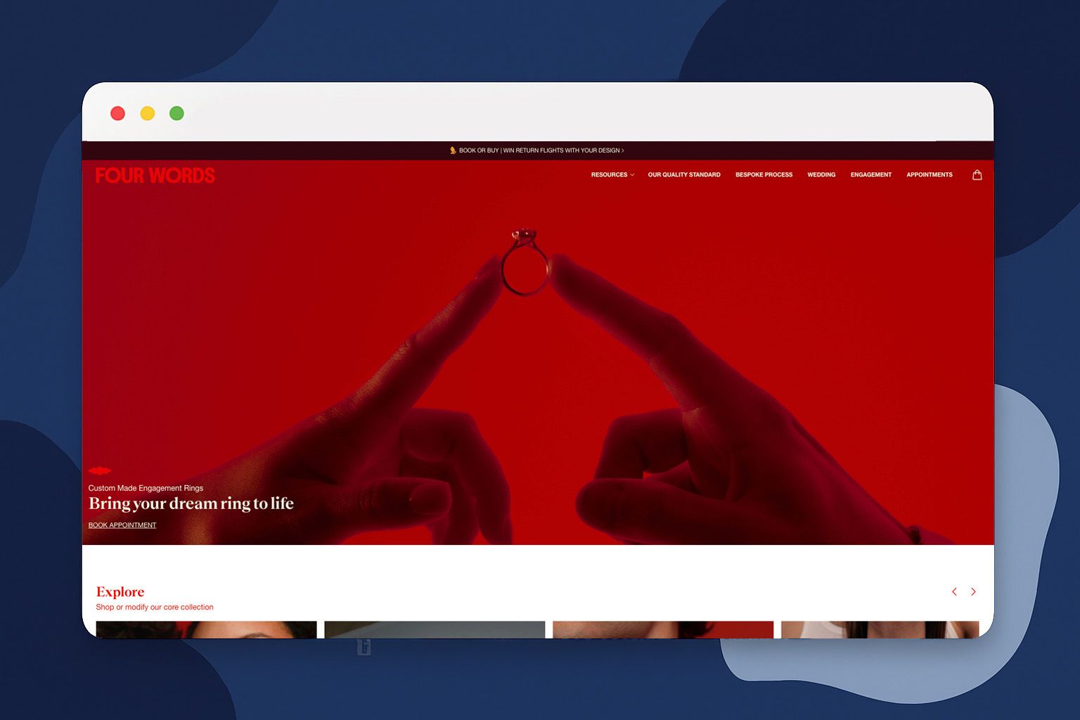
🔎 For this week's website review, let's look at Four Words. Four Words is a New Zealand-based ethical jewelry design studio specializing in bespoke custom pieces using lab-grown diamonds and responsibly sourced materials.
💡 The Good
The environmental claims are specific and measurable
Instead of vague "eco-friendly" language, the site leads with "7x less environmental impact than mined diamonds." That precision builds credibility with skeptical consumers who've seen too many greenwashing campaigns. The partnership with CarbonClick for carbon offsetting adds another layer of verifiable commitment.
The social proof on homepage
Displaying 5 out of 5 stars across 440 Google reviews on the homepage is a smart move. For a high-touch service where customers are investing significant money in custom work, seeing that hundreds of people have had positive experiences takes away a lot of the fear around the unknown.
The consultation process is clearly explained
Custom jewelry can feel intimidating if you don't know what to expect. The site breaks down exactly how the one-to-one designer collaboration works, emphasizes unlimited revisions, and offers both in-studio and virtual consultation options. This transparency removes friction for first-time custom jewelry buyers.
🔧 Suggestions
A portfolio gallery would inspire confidence
The site does a great job explaining the process but feels a bit light on showing finished pieces. A curated gallery of completed custom designs, organized by style or aesthetic, would help potential customers envision what's possible and get excited about their own project.
Pricing guidance would reduce inquiry friction
While custom work naturally varies in cost, even ballpark ranges like "engagement rings typically start from $X" would help customers self-qualify before booking a consultation. Right now, price-conscious shoppers might hesitate to reach out without any sense of investment level.
An interactive style quiz could streamline consultations
A short questionnaire helping customers clarify their aesthetic preferences before meeting with designers would make consultations more productive. Designers could arrive with preliminary concepts already aligned with customer taste, rather than spending the first meeting on preference discovery.
See you next time for another simple, high-impact strategy!
The LOGO.com Editorial Team
What did you like? 📢
Reply back with anything you enjoyed reading or want to learn more about and we’ll gift you a month of Brand Plan as a token of our appreciation.
