What’s the 80/20 newsletter? Created by LOGO.com, each issue breaks down one small but powerful marketing tip that drives big results for businesses. Let’s get into it!
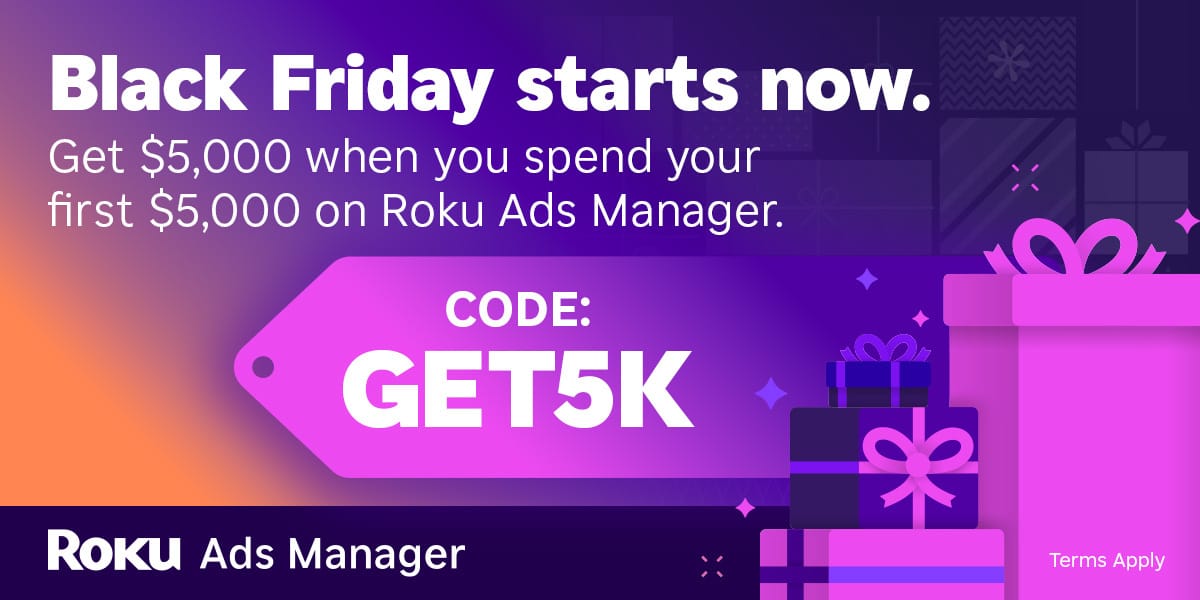
Find your customers on Roku this Black Friday
As with any digital ad campaign, the important thing is to reach streaming audiences who will convert. To that end, Roku’s self-service Ads Manager stands ready with powerful segmentation and targeting options. After all, you know your customers, and we know our streaming audience.
Worried it’s too late to spin up new Black Friday creative? With Roku Ads Manager, you can easily import and augment existing creative assets from your social channels. We also have AI-assisted upscaling, so every ad is primed for CTV.
Once you’ve done this, then you can easily set up A/B tests to flight different creative variants and Black Friday offers. If you’re a Shopify brand, you can even run shoppable ads directly on-screen so viewers can purchase with just a click of their Roku remote.
Bonus: we’re gifting you $5K in ad credits when you spend your first $5K on Roku Ads Manager. Just sign up and use code GET5K. Terms apply.
The 80/20 Email Takeaway Rule
Ever notice how some websites talk about their "advanced analytics dashboard" or "AI-powered features" while you're left wondering, "But what does this actually do for me?"
You're not alone – most businesses focus on what they have rather than what you'll achieve.
💡 This week's 80/20 rule - Write shorter, skimmable emails with one clear takeaway.
In other words, most readers scan emails rather than read them word-for-word, so short paragraphs, bullet points, and clear calls-to-action make it easier for them to understand and engage with your message.
Why This Rule Works
🧠 Our brains are wired for efficiency, especially when it comes to digital content.
Research shows that email reading time has plummeted from 13.4 seconds in 2018 to just 9 seconds in 2022 – that's a 33% drop in attention span in just four years! This isn't because we're becoming less intelligent; it's because we're adapting to information overload.
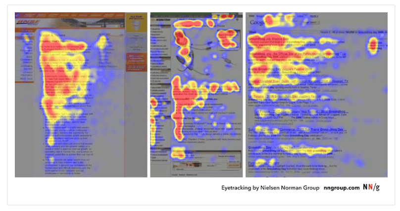
Think about your own inbox. When you open an email, you're not settling in for a long read – you're quickly scanning to determine if it's worth your time. Your brain follows what researchers call the F-shaped reading pattern, where you read the first few lines horizontally, then scan vertically down the left side, picking out key information.

The mobile revolution has accelerated this trend even further. With 61% of email opens happening on mobile devices, your carefully crafted 500-word masterpiece is being viewed on a 5-inch screen during someone's coffee break.
Businesses That Leverage This Rule
💰 Dollar Shave Club revolutionized the razor industry not by explaining blade technology, but with punchy emails like "Shave Time. Shave Money." While competitors wrote dissertations about precision engineering, Dollar Shave Club focused on what customers actually cared about: convenience and savings.
🍹 Skinny Fizz provides a dramatic transformation story. This New Zealand beverage company was struggling with minimal email engagement and low repeat orders. After adopting a brevity-focused strategy with concise, single-objective emails, they saw a remarkable improvement in customer engagement and a stronger connection with their audience.
🐕 PetLab Co. faced the challenge of communicating about diverse dog supplements. Instead of trying to educate everyone about everything, they switched to targeted, brief emails focused on single benefits. This led to significantly improved click rates and a notable lift in opens, proving that a clearer, more focused message resonates better with readers.
How to Apply This Rule to Your Business
🤝 For Service-Based Businesses
Structure every email around the 50-word opening rule
Your first 50 words should contain the specific problem you're solving, the outcome the reader will achieve, and one clear action to take. For example, instead of "We offer comprehensive digital marketing services..." try "Your website traffic has plateaued. We can help you improve it by using our proven SEO framework."
Use the "one email, one idea" principle
If you have five services, send five focused emails over time rather than one overwhelming message. Each email should drive toward a single, specific action.
Master your subject lines
Instead of "Monthly Newsletter - October Edition," try "Cut your admin time in half (15-minute read)." Focus on the specific benefit your reader will gain.
🛍️ For Ecommerce Stores
Let visuals do the heavy lifting
Product images communicate faster than descriptions. Your text should simply state the offer clearly (20% off, Free shipping, etc.), create urgency if genuine, and provide one-click purchasing.
Structure promotional emails in layers
Start with a headline that states the offer in 5 words or less. Follow with a visual. Add details in bullet points. Place a prominent CTA button both above and below the fold.
Test removing elements, not adding them
Start with your current emails and systematically remove sections. One client found that removing their company story paragraph from promotional emails increased clicks by 35%.
Time your sends strategically
Since shorter emails are consumed quickly, timing is critical. Test sending during high-activity periods when people are actively checking email but have limited time – like morning commutes or lunch breaks.
Summary of Rule and Actions
1️⃣ Audit your current emails immediately. If any are over 150 words, flag them for rewriting.
2️⃣ Apply the "9-second test." If you can't communicate the core message and CTA within 9 seconds, it's too long.
3️⃣ Rewrite using the 50-125 word sweet spot. Challenge yourself to convey the same message in half the words.
4️⃣ Design for mobile-first scanning. Use short paragraphs (2-3 sentences max), bullet points, and a thumb-friendly CTA button.
Website Review

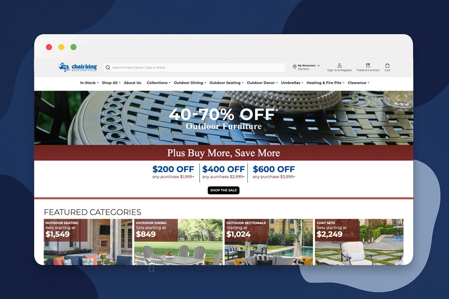
🔍 For this week's website review, let's look at Chair King Backyard Store. Chair King is a Texas-based outdoor furniture retailer that's been family-owned for over 70 years. Their website demonstrates how traditional brick-and-mortar businesses can create sophisticated e-commerce experiences while maintaining their personal touch.
💡 The Good:
Custom Shipping Solution is Their Superpower: Chair King solved one of furniture e-commerce's biggest problems with their custom shipping calendar that appears at checkout.
Perfect Balance of Information and Simplicity: Chair King nails the sweet spot with comprehensive filtering, detailed product specs, and multiple high-quality images while maintaining clean, navigable layouts.
Mobile-Responsive Without Sacrificing Functionality: Despite being image-heavy with complex product variations, the site maintains fast load times and full functionality across devices.
🔧 Suggestions:
Add Product Comparison Functionality: Implementing side-by-side comparison tools would help customers evaluate multiple furniture pieces more effectively.
Implement AR or 3D Visualization: Augmented reality features could help customers better understand scale and fit in their spaces.
Enhance Search with Natural Language Processing: The current search could be improved with more intuitive filters and better handling of natural language queries.
See you next time for another simple, high-impact strategy!
The LOGO.com Editorial Team


