What’s the 80/20 newsletter? Created by LOGO.com, each issue breaks down one small but powerful marketing tip that drives big results for businesses. Let’s get into it!
The 80/20 Blink Test Rule
Ever notice how you'll spend hours perfecting your website's features, only to watch visitors bounce within seconds? You're not imagining it – most people decide whether to stay or leave your site in less time than it takes to read this sentence.
Here's the harsh reality: Your visitors are making snap judgments, and if your site doesn't instantly communicate what you do and why they should care, they're gone.
💡 This week's 80/20 rule - Pass the "Blink Test" by ensuring your website clearly communicates its main message and desired action within 3 seconds.
In other words, if a first-time visitor can't immediately understand what you offer and what they should do next after a quick glance, you're losing potential customers before they even give you a chance.
Why This Rule Works
🧠 The science behind the Blink Test reveals a fascinating truth about human psychology: we form first impressions of websites in just 50 milliseconds. That's faster than the blink of an eye – literally 20 times quicker than it takes to blink.
This lightning-fast judgment happens because our brains are hardwired for instant evaluation, a survival mechanism that helped our ancestors quickly assess threats and opportunities. In the digital world, this same mechanism determines whether visitors engage with your content or hit the back button.
Here's where it gets interesting: 94% of first impressions are design-related, not content-related. Your visitors aren't reading your carefully crafted copy in those first moments – they're making an emotional judgment based on visual cues, layout clarity, and how easy it appears to find what they need.
The psychological principle of cognitive load explains why simplicity wins. Our brains have limited processing power, and when faced with a complex or confusing website, we experience mental fatigue. It's like walking into a cluttered store where you can't find what you're looking for – frustrating and exhausting.

Research shows that websites with fewer than 10 key elements convert at twice the rate of those with 40 or more elements. Think of it this way: When someone lands on your website, they're not looking to solve a puzzle. They're looking for a solution to their problem. The Blink Test ensures you're presenting that solution clearly, not hiding it behind clever design or buried in paragraphs of text.
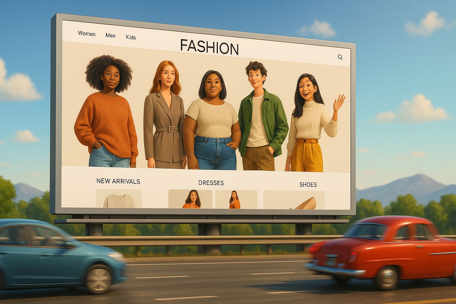
The average attention span has dropped to just 8 seconds, and on mobile devices, users make engagement decisions in as little as one second. This compressed timeline means your website needs to work like a billboard on a highway – delivering its message instantly to people speeding by.

Businesses That Leverage This Rule
👓 Warby Parker succeeded by making the complex process of buying glasses surprisingly simple and stylish online. Their website immediately greets visitors with a clean aesthetic and a straightforward message: "Find your perfect pair." The "Home Try-On" program is featured prominently, instantly communicating their key differentiator and removing the biggest friction point of buying glasses online. This clear, risk-free value proposition allowed them to disrupt a centuries-old industry.
🛏️ Casper transformed the mattress industry by eliminating the overwhelming and confusing showroom experience. Their site uses calming colors and concise text, often leading with a simple, confident statement about creating the "perfect mattress." The "100-night risk-free trial" is always a focal point. This instantly removes buyer's remorse and makes the decision to purchase incredibly low-risk, a message that is understood in seconds.
👟 Allbirds took the footwear world by storm with a laser-focus on comfort and sustainability. When you land on their site, you're not bombarded with technical specs. Instead, you're met with images of people enjoying the shoes and simple, benefit-driven headlines like "The World's Most Comfortable Shoes." They immediately convey their core promise, making the decision to explore their products an easy one for anyone seeking comfortable, eco-friendly footwear.
How to Apply This Rule to Your Business
🤝 For Service-Based Businesses
Start with a Fresh Eyes Audit
Ask someone unfamiliar with your business to look at your homepage for exactly 3 seconds, then tell you what you do and what action they should take. If they can't articulate your core service and value proposition clearly, you've found your biggest conversion leak. This simple test reveals whether you're communicating like an insider (using industry jargon) or speaking your customer's language.
Rewrite Your Headline Using the Clarity Formula
Replace vague headlines like "Strategic Business Consulting" with specific, outcome-focused messaging: "I help SaaS startups grow their revenue through customer retention strategies." This formula works because it immediately tells visitors who you serve, what result you deliver, and hints at your unique method. Your headline should pass the "so what?" test – if someone reads it and thinks "so what?" you need to be more specific about the outcome you provide.
Apply the Above-the-Fold Priority System
Place only three elements above the fold: your clear value proposition, a brief explanation of who you serve, and one primary call-to-action. Everything else – including lengthy mission statements, rotating banner images, and walls of certification logos – should move further down the page. Think of above-the-fold space like prime real estate: every pixel should earn its place by directly supporting visitor understanding or action.
Simplify Your Navigation to Prevent Decision Paralysis
Limit your main navigation to 5-7 items maximum, focusing on the paths that matter most: Services, About, Case Studies, and Contact. Research shows that too many choices create decision paralysis, causing visitors to choose nothing at all. Move secondary pages like privacy policies, detailed company history, and extensive resource libraries to your footer or create dedicated resource sections.
🛍️ For Ecommerce Stores
Answer the Three Critical Questions Instantly
Your homepage must immediately communicate: What do you sell? Who is it for? Why should I buy from you instead of Amazon? If these aren't crystal clear within 3 seconds, you're losing sales to confusion. Test this by showing your homepage to someone unfamiliar with your brand and timing how long it takes them to answer these questions accurately.
Lead with Your Unique Value Proposition
Replace generic welcome messages with specific differentiation: Instead of "Welcome to our store," try "Handcrafted leather goods that last a lifetime." This immediately sets expectations, differentiates you from mass-market competitors, and gives visitors a compelling reason to explore further rather than defaulting to familiar retailers.
Showcase Hero Products with Complete Information
Display your best-selling or highest-margin products prominently with high-quality imagery, clear pricing, and availability status. Don't make visitors hunt for basic information like cost or stock levels. E-commerce sites that display prices upfront see higher conversion rates because transparency builds trust and helps visitors quickly qualify whether your products fit their budget.
Optimize Ruthlessly for Mobile Experience
Since 79% of landing page traffic comes from mobile devices, ensure your mobile site passes the Blink Test with thumb-friendly buttons, readable text without zooming, and a simplified checkout process. Mobile users make decisions even faster than desktop users, so your mobile experience needs to be even clearer and more streamlined than your desktop version.
Summary of Rule and Actions
1️⃣ Conduct a 3-second audit. Show your website to someone unfamiliar with your business. If they can't explain what you do and what action to take, you need to simplify your messaging and design immediately.
2️⃣ Rewrite your headline for clarity. Remove jargon, feature lists, and clever wordplay in favor of crystal-clear benefit statements that resonate with your target audience.
3️⃣ Eliminate visual clutter. Remove any element that doesn't directly support your primary message or call-to-action. Aim for fewer than 10 key elements on your homepage to double your conversion potential.
4️⃣ Position your CTA prominently. Make your primary call-to-action impossible to miss with contrasting colors and action-oriented language that clearly states what happens when someone clicks.
Website Review

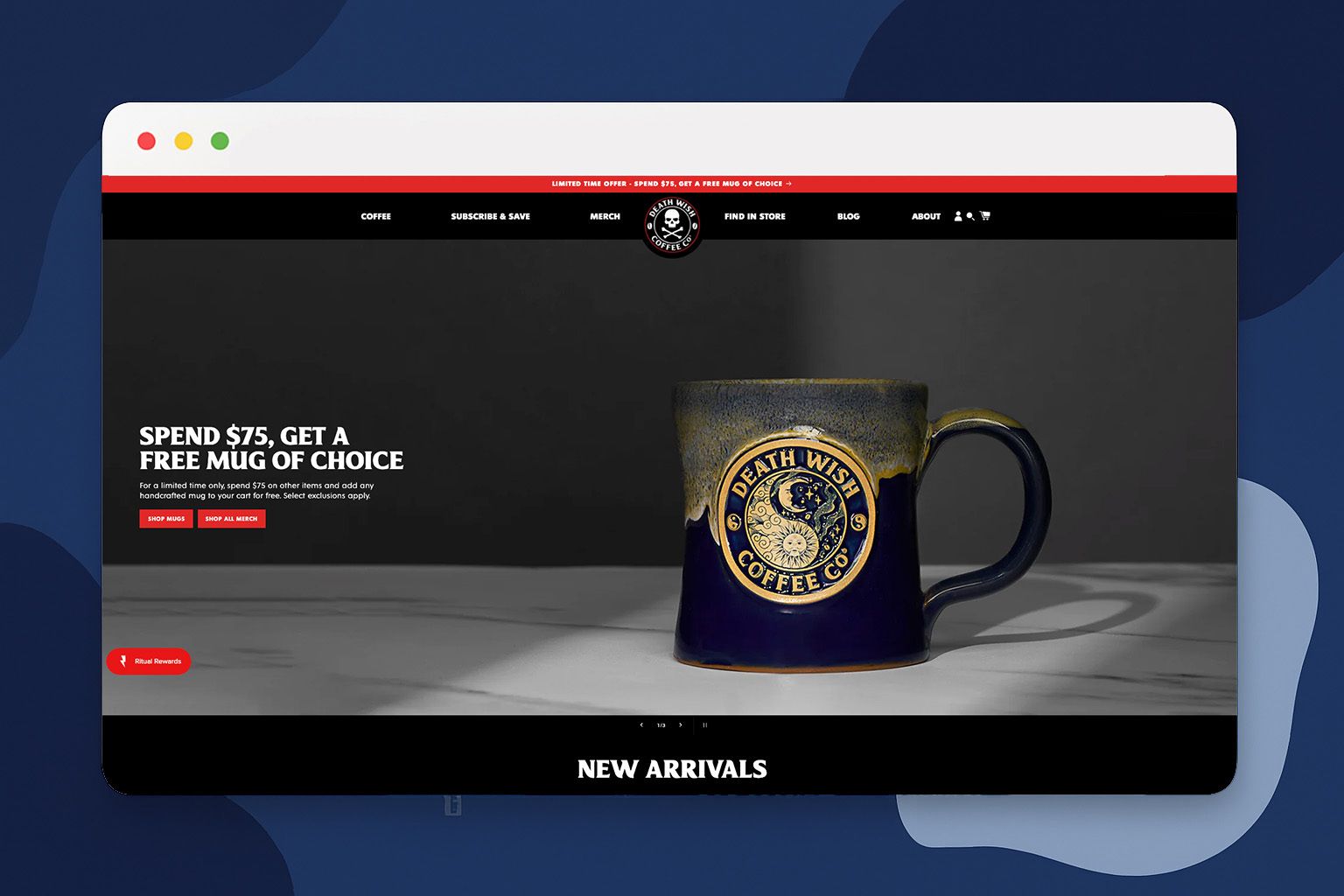
🔎 For this week's website review, let's look at Death Wish Coffee Company. Death Wish Coffee Company is a specialty coffee roaster from Saratoga Springs, New York that positions itself as the "world's strongest coffee." Their website successfully balances rebellious brand personality with sophisticated e-commerce functionality.
💡 The Good:
Authentic Brand Voice That Builds Community: Death Wish Coffee doesn't just sell coffee—they've created a community of "sarcastic, cynical coffee-drinking misfits" who genuinely connect with their rebellious messaging. Their dark color scheme, edgy typography, and bold imagery consistently reinforce their "world's strongest coffee" positioning across every page, creating immediate brand recognition and emotional connection.
Smart Video Integration Without Performance Sacrifice: They've implemented low-weight video elements throughout product pages that activate without impacting load times. This creates dynamic visual engagement while maintaining optimal site speed—a crucial balance that many businesses struggle with.
Conversion-Optimized Product Discovery: The quick-shop feature on collection pages streamlines purchasing by allowing customers to add products to cart without leaving category pages. This reduces friction in the buying process and increases add-to-cart rates by eliminating unnecessary page loads and navigation steps.
🔧 Suggestions:
Enhanced Mobile Checkout Experience: While their desktop experience is polished, the mobile checkout could benefit from one-click payment options like Apple Pay or Google Pay positioned more prominently. Given that mobile commerce continues growing, streamlining the mobile purchase flow could significantly impact conversion rates.
Personalized Product Recommendations: The site could leverage customer purchase history and browsing behavior to suggest complementary products or new releases. Adding "customers who bought this also bought" sections or personalized homepage content would increase average order values while improving the discovery experience.
Expanded Social Proof Integration: While they have strong brand community engagement, incorporating more customer photos and user-generated content directly on product pages would provide additional purchase validation. Real customers enjoying their coffee in authentic settings would complement their existing testimonials.
See you next time for another simple, high-impact strategy!
The LOGO.com Editorial Team
