What’s the 80/20 newsletter? Created by LOGO.com, each issue breaks down one small but powerful marketing tip that drives big results for businesses. Let’s get into it!
AI-Power Your Website
Launch your business with a professional AI-powered website. Instantly create a website tailored to your brand and industry with LOGO.com x Wix.
The 80/20 Headline Rule
Ever notice how you have about 3 seconds to grab someone's attention on your website before they hit the back button?
That's not much time to make your case, especially when visitors are deciding whether to stay or leave based on what they see without even scrolling.
💡This week's 80/20 rule - Place your primary headline and call-to-action above the fold where visitors can see them immediately without scrolling.
In other words, the most valuable real estate on your website is the area visitors see first, and optimizing this space can dramatically boost engagement and conversions without redesigning your entire site.
Why This Rule Works
🧠 The psychology behind this rule is rooted in how our brains process information and make split-second decisions online. Research shows that human attention spans have dropped to just 8 seconds, and visitors make judgments about your website's relevance within the first 3 seconds of arrival.

Think about it like walking into a store. If you can't immediately tell what the store sells or where to find what you need, you're likely to turn around and leave. The same principle applies to websites.
Studies reveal that 80% of user attention focuses on content positioned above the fold, and this content garners 57% of total viewing time.
The science gets even more compelling when you look at user behavior patterns. Eye-tracking studies show that people scan websites in an F-shaped pattern, focusing primarily on the top and left portions of the page.
Here's the kicker: 99% of webpage visits follow a pattern where the first 10 seconds are absolutely critical. If users don't find what they're looking for immediately, they leave. But if your above-the-fold content hooks them, they're much more likely to scroll down and explore further.
Businesses That Leverage This Rule
🚀 HubSpot masterfully uses their above-the-fold space with a growth-oriented headline that immediately communicates value. Their "go-to-market teams" messaging suggests forward momentum, while their prominent "Get started free" CTA removes barriers to entry.
🌯 Chipotle - For a restaurant, the user’s goal is often very specific: order food or find a location. Chipotle’s website prioritizes this perfectly. Above the fold, you’ll find a clear path to the menu and a prominent "Order Now" button.
🛍️ Shopify demonstrates the power of visual contrast with their prominent green CTA button that's impossible to miss. They address e-commerce entrepreneurs' pain points directly in their headline while keeping the design clean and focused.This strategic simplicity has helped them capture a massive share of the e-commerce platform market.
How to Apply This Rule to Your Business
🤝 For Service-Based Businesses
Identify Your Primary Action
Start by identifying the number one action you want visitors to take. Is it booking a consultation? Requesting a quote? Make that action impossible to miss above the fold.
Craft a Benefit-Driven Headline
Place your most compelling benefit-driven headline at the top of your page. Instead of "Welcome to ABC Consulting," try "Get 20% More Leads in 30 Days" or whatever specific outcome you deliver.
Design Your CTA for Maximum Impact
Position your primary CTA button prominently with action-oriented text. "Book My Free Strategy Call" beats "Contact Us" every time. Use contrasting colors to make it pop against your background.
Add One Trust Element
Include one trust element above the fold - this could be a client logo, a certification badge, or a brief testimonial. But don't clutter the space. Remember, you're guiding visitors to one specific action.

🛒 For Ecommerce Stores
Feature One Primary Focus
Your homepage should feature one primary promotion or product category above the fold. Resist the temptation to showcase everything. If you're running a seasonal sale, make that your hero.
Create Dedicated Landing Pages
If you're promoting a specific product line through ads, don't send traffic to your general homepage. Build a page where that product line is the star above the fold.
Remove Checkout Distractions
No promotional banners or social media buttons near the checkout button. The only above-the-fold elements should guide toward purchase completion.
Use Urgency Wisely
"Only 3 left in stock" or "Sale ends in 24 hours" can motivate immediate action when placed prominently above the fold.
Summary of Rule and Actions
1️⃣ Audit your current above-the-fold content by taking a screenshot of what visitors see without scrolling. Ask yourself: Is my value proposition crystal clear?
2️⃣ Rewrite your headline to focus on the primary benefit you deliver, not what you do. Test different versions that speak directly to your ideal customer's biggest pain point.
3️⃣ Position one clear, contrasting CTA button above the fold with specific action-oriented text. Make it the obvious next step for interested visitors.
4️⃣ Optimize for mobile by ensuring your headline and CTA are fully visible on common smartphone screens. Test on actual devices, not just browser emulators.
5️⃣ Remove any elements above the fold that don't directly support your primary conversion goal. Every pixel of above-the-fold space should earn its place.
Website Review

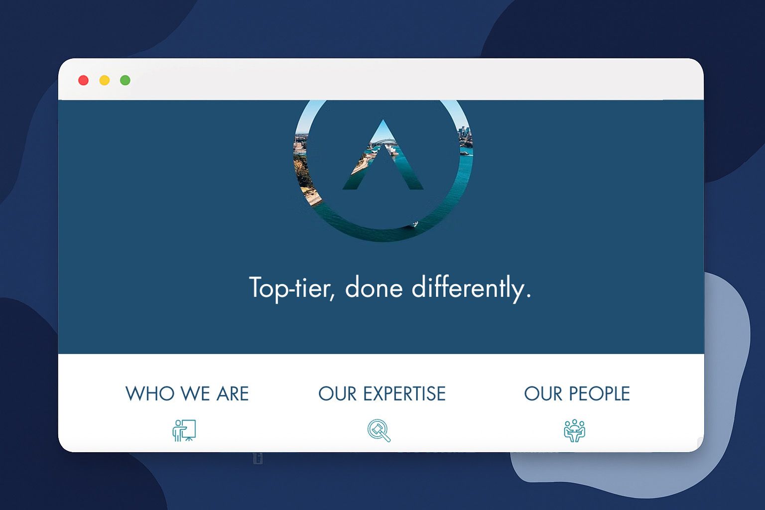
🔎 For this week’s website review, let’s look at Strauss & Partners. Strauss & Partners is a boutique commercial law firm in Sydney, Australia. Their website does a great job of establishing a professional, credible, and sophisticated online presence.
💡 The Good:
Powerful Value Proposition: Their tagline, "Top-tier, done differently," immediately tells you their unique selling point: high-end legal quality without the massive firm costs. It's clear, confident, and effective.
Clean, Professional Design: The site is minimalist and avoids cheesy legal stock photos. The clean layout and use of white space make it feel modern and trustworthy.
Highlights Founder's Expertise: The site prominently features the founder's impressive 20+ years of experience at a premier firm. For a service business, this is a crucial way to build instant credibility.
🔧 Suggestions:
Break Up the Text: The pages are very text-heavy so adding some simple visual elements like icons for each practice area or a professional headshot of the team would make the content more engaging and easier to scan.
Make the CTAs Stronger: The calls-to-action are understated. Using more prominent, action-oriented buttons like "Schedule a Confidential Consultation" can better guide potential clients to the next step.
Add an "Insights" Section: A blog or insights section would be a perfect way to demonstrate ongoing expertise, share valuable information, and attract highly qualified search traffic.
See you next time for another simple, high-impact strategy!
The LOGO Editorial Team
